The Importance of Color in eCommerce – Part II
Last week, we went over the basics of color palettes in website design and their hidden meanings. After understanding the basics, you can start getting deeper into understanding how this applies to your website and target market. In a 2003 study by Joe Hallock, he found that men and women had different color preferences:
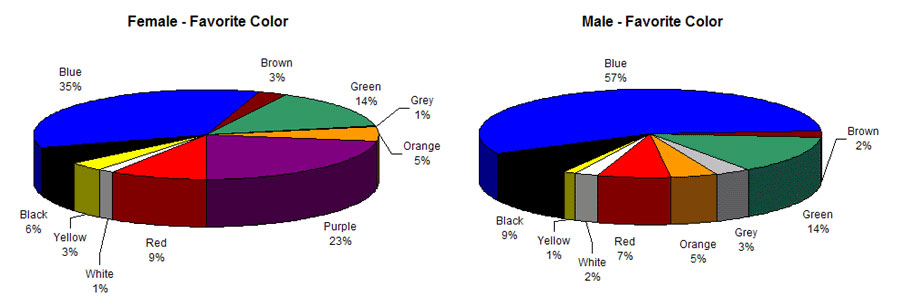
The biggest takeaways from these graphs is that while blue is the favorite color for both men and women, the two groups could barely disagree more about purple. Women listed purple as a strong choice (second only to blue) of color, but no men listed purple as a favorite color. The study also provided least favorite colors by gender: brown for men and orange for women.
In another study reported in a KissMetrics infographic on gender differences by color, more detailed color choices surfaced:
- When asked to choose from mixed colors, women liked colors closer to the red end of the spectrum, such as pink
- Men preferred bright colors, while women preferred more muted colors
It’s not just about your color palette…
Your website should be easy to read, so background and text colors are also an important consideration. Don’t fall victim to the 90s era of web design and use something like bright blue on a black background or vice versa. (I bet you had to highlight that to read it, hmm?)
White is generally a good choice of background color, because it provides the most legible background for most text colors. Alternatively, pale or pastel color backgrounds can work with darker text.
Use colors to guide your visitors
Ever since the days of yore on the Internet, links have been blue and underlined, but they’re not necessarily that way any more. The one trait they have retained is their difference in color in relation to the body text. While you may have a standard text color for your content, use a bright eye-catching color for your links and your “call to actions” (like your Buy or Subscribe buttons).
When you put all of this information together, you can come up with strategic uses for color for your website. Take a peek at Mozilla’s (makers of the browser Firefox) website for an example.
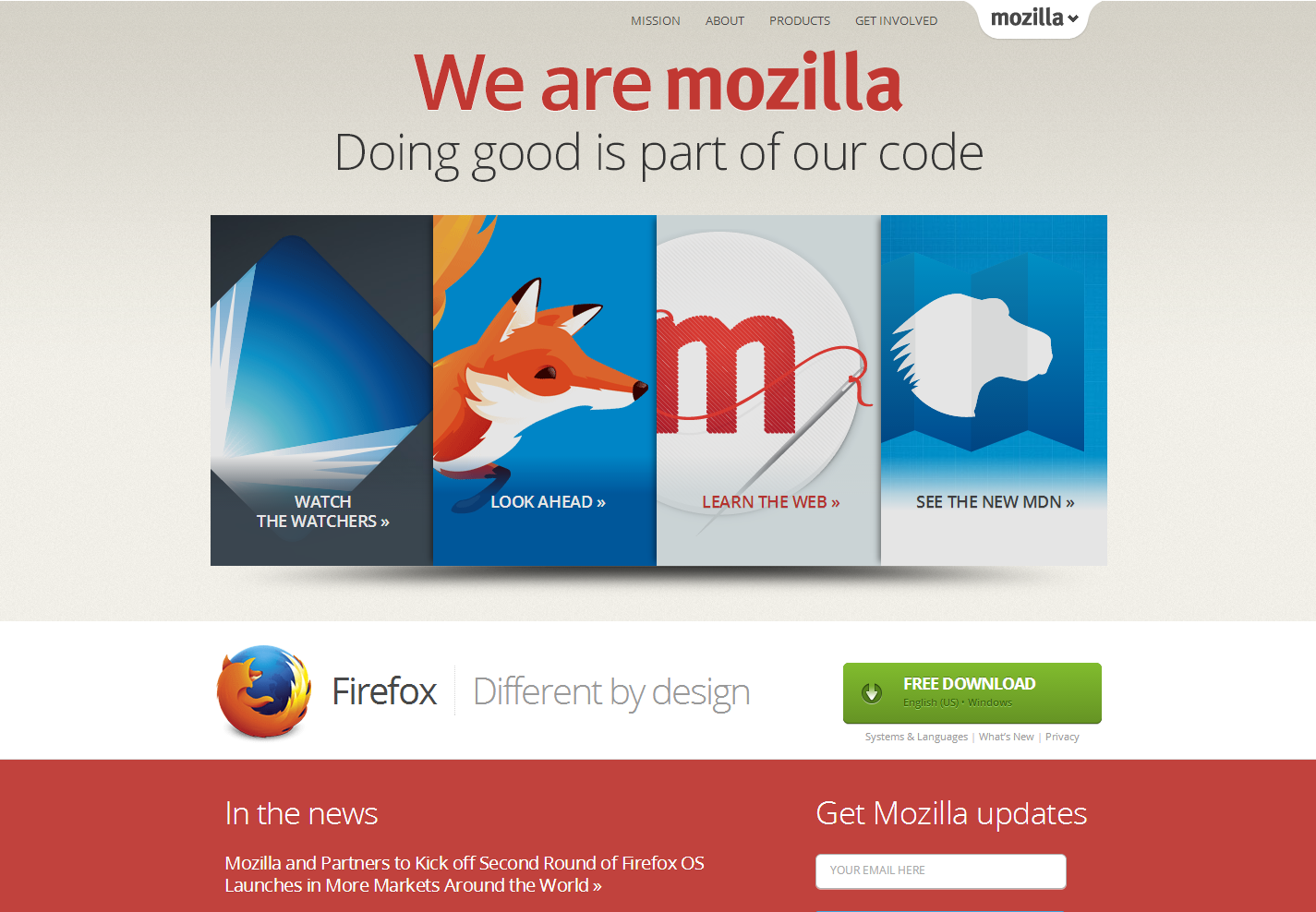
The majority of the page is a neutral beige with a strong footer and a colorful section “above the fold” (meaning the space above the spot where you have to start scrolling the page to see more). The stark contrast of the bright blue against the orange and beige give you a good anchor for your eyes to start investigating what’s on the page. And the call to action is green—the only potion of the page that is that color.
Next time you have a free minute—or if you are considering a website redesign—go to your favorite websites. Take a look at how they use color instead of just browsing their content. How many colors do they use? How do they guide your eyes from one element to another so that they finally rest on what they want you do to? How do they direct you to their call to action?
Here are some of my favorite sites, in case you’re looking for some inspiration:
Color will always be a topic of conversation, especially as the web keeps evolving and design standards keep changing—just think of all the design changes and trends that have come about in the last year, nevermind the last decade. (Want an example? Look at the infographic from last week’s post versus the graphs up above.) Of course, the entire usability of your site is of paramount importance, in addition to its’ color palette, but that’s another conversation entirely. ;)