Manipulate your Reports with Excel’s PivotTables!
In ShipStation, we give you the ability to export your data into CSVs, a format that can be read by a number of different programs, but most notably, Microsoft Excel. Some of you may have heard of a feature in Excel called PivotTables. Simply put, PivotTables are awesome. Yes, they are a little difficult to wrap your head around when you first look at them, but they can be incredibly powerful.
For this post, we’ll go over a specific example so that you can see how these things work. Let’s say that we want to find out what our Quarter 1 sales were for all of our stores. We’ll be using Excel 2013 for this example, so if you have a different version or are on a Mac, your menu options may be in a slightly different place.
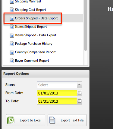
First, let’s go into ShipStation and download the “Orders Shipped – Data Export” report. So, after clicking on Reports in the top menu, highlight the appropriate line and choose the date range for the first quarter: 1/1 – 3/31.
Download the file and open it in Excel. Now, for a bit of terminology. The file you have open is called a Workbook. There are individual “sheets” (aptly called worksheets) much like individual sheets in a notebook that can contain their own information.
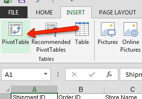
At the top of the screen, click the Insert tab, and then choose PivotTable. (If you’re on a Mac, PivotTables should be under the “Data” tab. Also, choose a “Manual PivotTable.”)
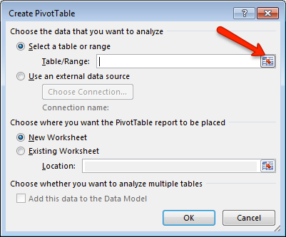
There’s a new window that will pop up that will let you create your PivotTable. If Excel does not automatically populate with the right range of data (it did for me in Excel 2013, but did not in the Mac or Windows versions of 2011), click the right icon. If your range is correct, then go ahead and skip the next few paragraphs.
If you know how to select all your data (without any extra space, mind you), then go ahead and skip the next few paragraphs.
Now, put your mouse in the top-left corner of your worksheet, and then hold Shift + Control + Right Arrow. (If you’re on a Mac, replace Control in this keystroke with Command.) This should highlight the entire first row’s cells that have data in them. You should have “Sheet!$A$1:$AX$1” in that white box right now.
Now we need to select the rest of the data. So, hold Shift + Control + Down Arrow. You may need to do this a couple times just because the keyboard shortcut will not select data that has gaps in it. Meaning, if there is a blank line in the middle of your worksheet, the Shift + Control + Down Arrow keyboard shortcut will only select the data up to the first blank area.
Once you’ve selected all your data, that little white box should have something like Sheet!$A$1:$AX$3042 in it. This means that all columns from A1 to AX are selected, and all rows from 1 to 3042 are selected. Basically, we’ve selected all your data.
Now, click the right icon again and the original window for PivotTables will appear.
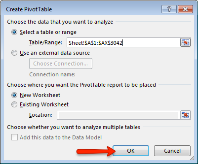
Make sure that you have the “New Worksheet” box checked, and click OK.
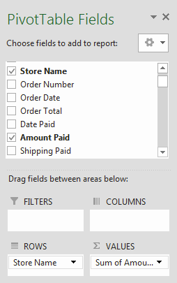 Here’s the fun part: manipulating your data. Again, for this example we’ll be looking at our quarterly sales per store that we originally set out to do. In the right hand panel, check the boxes next to Store Name and Amount Paid. Excel should figure out what you’re trying to do and sort everything appropriately. (When I was testing this on the Mac, I did have to drag Store Name over to the “Row Labels” area for the Pivot Table to work the way I wanted it to.) On that note, you can actually drag the different fields into the boxes below and separate out your data. Additionally, you could then filter it.
So, if you wanted to see to which states your orders were shipped, you could drag the “Ship State” onto the “Column Labels” area. Then, if you wanted to filter it by country (meaning, you only see selected country’s states at one time), drag “Ship Country” onto the “Report Filter” area.
That’s it for this tutorial. We’ve listed a few more examples of types of PivotTables that you could make with the reports from ShipStation. Once you get the hang of the tool, you’ll see just how much information these reports hold, and how you can manipulate it to show what you want.
Examples:
- Number of orders by carrier (consider using this for possibly negotiating lower rates for your UPS/FedEx account)
- Quantity of products for a date range (see what your hottest moving products are)
- Use the Ship State as a Column Label to see if there are any geographical trends in where your products are purchased
- Use the Carrier or Service as a Column Label to see if there is a trend on how you ship each of your products (or even combine the two: Carrier as a filter and Service as a Column Label to limit the results)
- Customers by state/country
- Use Country as a Column Label and Orders as a Row Label to see if you have repeat customers in certain countries
Have some experience with PivotTables you’d like to share? Or, did you create a report that you think others might enjoy? Let us know in the comments below!
I’m Joe, the Lead Support Engineer for ShipStation and I help by handling the tickets that may need a developer’s eye or they’re just those “out of the ordinary” issues that need some time to troubleshoot. I enjoy helping out customers and especially giving them knowledge about ShipStation. In my free time, I enjoy fishing, playing soccer, and spending time with my wife and kids.