


Blog
From 50 to 50,000 Orders: Ecommerce Scaling Strategies That Actually Work
BigCommerce's Rachel Nolan breaks down the order volume inflection points where merchant operations start to crack—and what to do before they do.
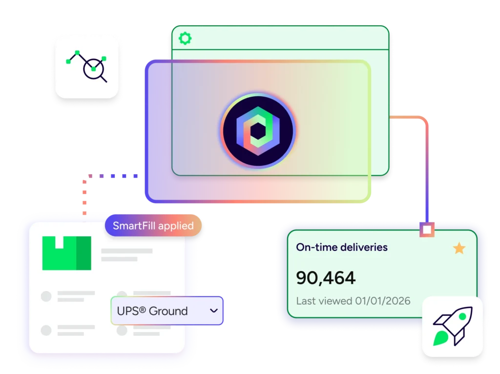
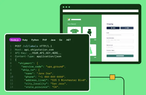
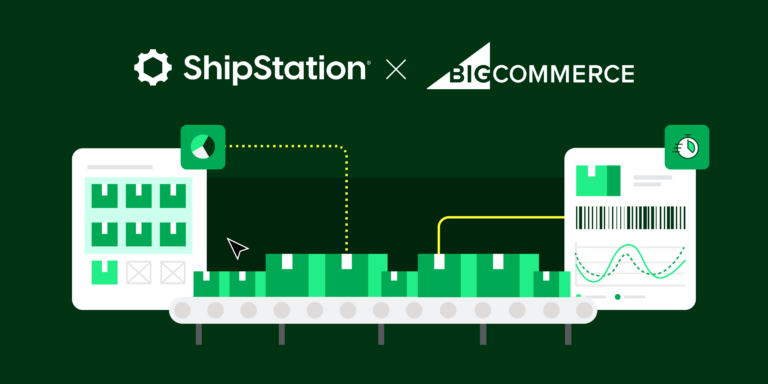
Help Shipping Teams Make Smarter Decisions with Less Manual Work
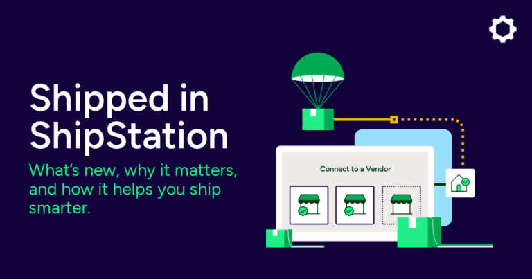
Shipped in ShipStation highlights new features, launches, and smarter shipping updates powered by ShipStation Intelligence. See what’s new and start shipping…
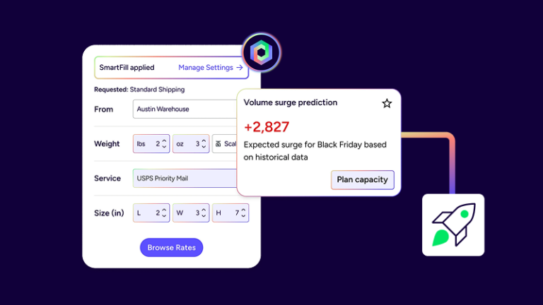
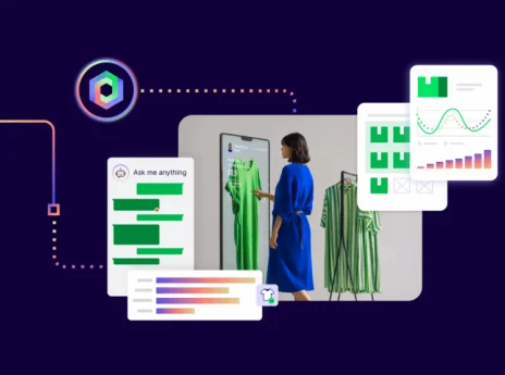
How Intelligence Helps Retailers Predict Issues and Protect Customer Trust
Delivery is no longer just logistics or an afterthought tacked on at checkout. It's a deciding factor. Tension arises where expectations meet complexity. Shipping at scale is complicated. Parcels fall…

How well do you know spring peak season?
For sellers in florals, confections, jewelry, and beyond, this is the season that matters most.

Delivery as a Competitive Advantage (Not a Cost Center)
Learn how the right tools can help any merchant turn ecommerce delivery experience into a real competitive edge.

The Customer Experience Era of Delivery
Retailers are increasingly realizing that delivery is not just about moving goods. It's about following through on commitments. This recognition is transforming how leading ecommerce companies approach shipping and fulfillment.

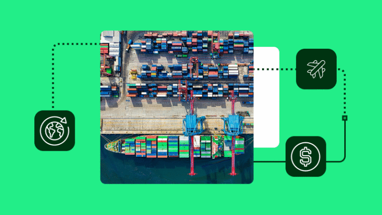
Middle East Shipping Delays: What Shippers Need to Know
Carriers including UPS, FedEx, USPS, and Royal Mail are all adjusting service. Here's what shippers need to know about Middle East shipping delays.

Celebrating Women Who Ship: 5 Business Owners on Building, Growing, and Doing It Their Way
For International Women's Day, we're spotlighting five women-owned ecommerce businesses that ship with ShipStation.
How to Compare International Shipping Quotes and Calculate Global Carrier Delivery Costs
Comparing international shipping quotes is not about finding the lowest line item. It’s about measuring the total cost to move a package from A to B. Published international shipping rates…
Keep up with the latest from ShipStation
Subscribe to our blog and get free shipping tips, insights, and resources delivered directly to your inbox.
One place for your business
Begin a free trial to see what’s possible with ShipStation.