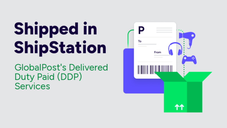


 Feature Spotlight


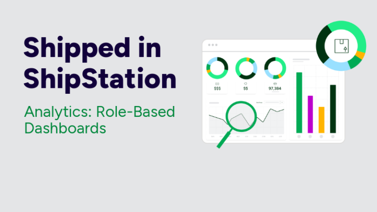
Shipping analytics shouldn’t feel like a scavenger hunt. It should help you spot what matters fast, then act. That’s why ShipStation API Analytics now includes Role-Based Dashboards built for the way your team really works. In this post, you’ll see what’s new in the Operations Overview tab, what each role gets on day one, and how to turn analytics into better shipping decisions.
If you build embedded shipping, you already know the problem. Data shows up everywhere. Ops has one view. Finance has another. Support lives in tickets. Engineering watches logs. Then someone asks, “Are we shipping better this month?” and everyone exports CSVs.
Analytics breaks down when it’s built as a single dashboard for every job. It creates noise. It slows decisions. It also hides key signals, like carrier delays, exception spikes, or an integration issue that’s quietly driving failed labels.
Role-based analytics fixes that. It puts the right metrics in front of the right person.
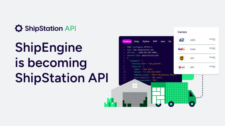
Role-Based Dashboards (Operations Overview) is the latest release in Shipped in ShipStation. It’s live for ShipStation API customers in the US starting February 27, 2026.
You’ll find it inside Analytics as a new Operations Overview tab. Instead of forcing everyone into the same view, it offers four curated dashboards. Each one surfaces a tight set of KPIs, so you spend less time filtering and more time deciding.
Power users don’t lose depth, either. Your existing deep-dive dashboards are still there when you want to drill in.
Operations Overview is built for teams that ship together but think differently. It guides each persona to the 4 to 6 metrics they care about most, right away. No hunting. No “which dashboard is this on?” Slack thread.
Here are the four role-based views you can switch between:
Same data. Different lens. Better conversations across the business.
Leaders don’t need a wall of charts. They need clarity. The Overview view is designed for executives who want to understand shipping performance without reading operational tea leaves.
You can use this view to spot:
This is where shipping analytics becomes a leadership tool, not a spreadsheet project. When the numbers move, you see it early. Then you can ask better questions, faster, with real context behind them.
Ops teams live in the real world. Packages miss scans. Carriers slip. A single bad workflow can create a pile of manual work by lunch.
The Operations & Logistics view is built to surface the signals that matter on the warehouse floor and in the shipping queue. Think exception spikes, delivery delays, and trends that point to process gaps.
Shipping analytics helps you:
Small fixes stack up. Fewer exceptions. Fewer errors. Less labor spent chasing avoidable issues.
Your customer doesn’t care which system generated the label. They care that the delivery promise feels true. When it doesn’t, you get WISMO. You lose trust. You lose the next order.
The Commerce & Customer Experience view focuses on delivery reliability and customer impact. It helps eCommerce and marketing teams connect shipping performance to the experience they’re designing.
Use this analytics view to:
Better delivery expectations start with better data. Real-world shipping data improves delivery predictions over time. That means fewer surprises for customers.
When shipping is embedded, your API performance is part of operations. A timeout isn’t “just a tech issue.” It can stop label generation. It can stall pick and pack. It can delay a truck.
The Technical Operations view puts system performance where it belongs: in a dashboard built for engineers and analysts. You can track key API health signals, like successful request rates, error patterns, and latency across calls.
This view pairs well with event-driven workflows. If you use webhooks for real-time notifications like shipment updates, you want fast awareness when something shifts. You can troubleshoot sooner, before the business feels the impact.
Sometimes you need a dashboard. Sometimes you need the dashboard to come to you.
ShipStation API Analytics supports lightweight ways to share and monitor data without building a separate BI pipeline:
This is how multi-team shipping stays aligned. Ops can get a weekly exception rollup. Finance can pull spend context. Engineering can watch for rising errors. Fewer status meetings. More action.
Dashboards are only useful when they lead to decisions. Role-Based Dashboards are designed to map to the workflows you already automate with ShipStation API.
Common loops look like this:
Your stack can stay white-labeled. Your users never need to see “ShipStation.” They still get the benefit of a battle-tested shipping engine with deep analytics behind it.
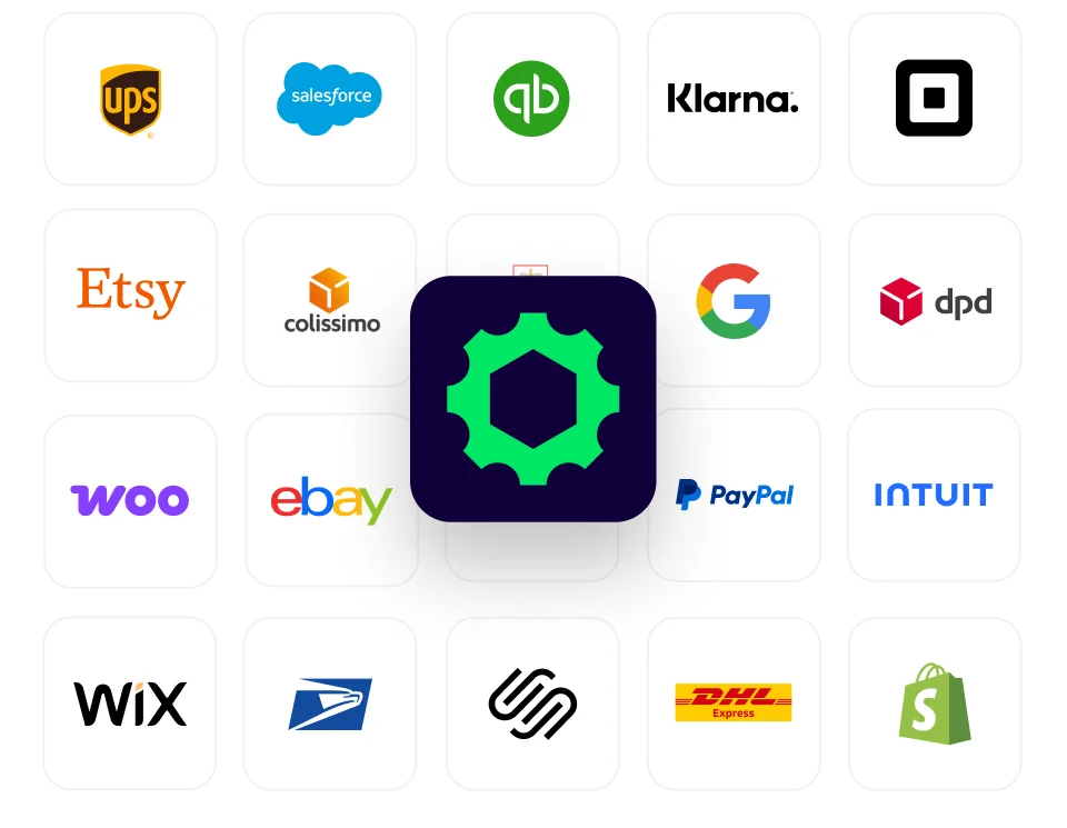
And when you ship across major carriers like UPS®, FedEx®, DHL Express®, and USPS®, analytics becomes even more important. Carrier performance varies by lane, season, and service. The data helps you adapt without rewriting your whole integration.
If you also offer add-on protection through ParcelGuard®, analytics gives you a clean way to measure exceptions and claims drivers alongside the rest of shipping performance.
At low volume, you can “feel” when shipping is off. At high volume, feeling fails. You need real signals. You need repeatable reporting. You need analytics that stays useful as your label count grows.
ShipStation API is built for scale, with a broad carrier network and an intelligence layer trained on real shipping activity. That matters because better decisions come from better data. Over time, shipping analytics becomes more than reporting. It becomes a feedback loop:
That’s how you ship smarter without adding chaos.
Role-Based Dashboards in ShipStation API Analytics turn shipping analytics into role-ready answers. Leaders get trends. Ops gets exceptions. Commerce gets customer impact. Technical teams get API health. All from the new Operations Overview tab, live for US ShipStation API customers starting February 27, 2026. If you’re building embedded shipping, this is a simpler way to keep every team focused and moving fast. Explore Analytics and put Operations Overview to work.
Role-Based Dashboards are curated analytics views inside the new Operations Overview tab. They surface a focused set of KPIs based on what each role needs. You can still access deeper dashboards when you want more detail.
They’re designed for four functional personas: executive leadership, operations and logistics, commerce and customer experience, and technical operations. Each view highlights the metrics that role uses to make daily decisions. It’s especially useful when multiple teams share the same shipping program.
Operations Overview is available to all ShipStation API customers in the US starting February 27, 2026. You can access it within the Analytics section. Look for the Operations Overview tab.
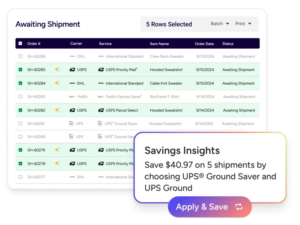
Yes. You can download raw data as CSV from a dashboard or from individual widgets. You can also schedule raw data deliveries and set up alerts on widgets, so key changes reach the right people without constant manual checks.
Native analytics reduces time to insight because it’s tied directly to your shipping activity and carrier behavior. It also helps non-technical teammates get answers without waiting on a custom report. Your BI work still matters, but role-based dashboards can cover the daily questions that slow teams down.