


Branded deliveries for your customers
Keep your brand top of mind from checkout to delivery with customized labels, branded email templates, and more
Make a big impression
Customize every customer touchpoint to create a more cohesive experience.
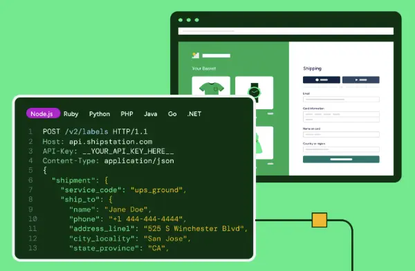
Labels

Tracking Page


“I figure if we offer the best stuff and put that out there and really make that our product ethos, we’ll hopefully start to change not only our own practices but other businesses as well.”
Kevin Espiritu
CEO and Founder of Epic GardeningOne place for customized branding
Begin a free trial to see what’s possible with ShipStation.