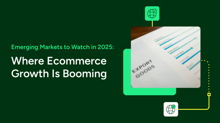
Are You Ready for Mobile Users?

Published on January 4, 2022
Written by
Filed under Selling Channels
Read time 6 Minutes

2013’s three big shopping days—Thanksgiving day, Black Friday, and Cyber Monday—hit record sales numbers ($4.6 billion). But, did you know that 20% was mobile commerce? That’s $940 million spent in just three days over phones and tablets in the US. Just as noteworthy: Some reports show that the majority of time spent with online retailers occurred on mobile devices.

If you’re an online retailer, you can’t afford to ignore mobile customers. This means making sure your website is mobile-friendly. The folks over at Green Chameleon Design had a snafu recently with a particular page on their site concerning mobile users:

As you can see, it did not go over well with potential customers. For many of us, however, creation of a mobile-friendly site just seems like one more item in a long list of activities we have to do to maximize our sales efforts. But, if you’re taking the advice of our post on spring cleaning your eCommerce website, making your site mobile-friendly is something that should be part of your to-do list.

Option 1:

The quickest and easiest option to do if your site doesn’t already have mobile capability is to build a second site just for mobile users. If you visit some sites on your mobile device, like IGN, Twitter, Taco Bell, and Wal-Mart, you’ll notice that they have special versions of their site that are specifically designed for mobile devices. But, as you just saw if you visited any of those links, it can cause issues if someone goes to that site on their desktop since they will not automatically be routed to the correct version for their device type.

In this article by Jakob Nielsen, he recommends the following design guidelines for mobile websites:

  • Delete features to eliminate items not critical for mobile users
  • Eliminate content to reduce word count
  • Magnify interface elements to accommodate the “fat finger” problem

The key is to cut the amount of work you have to do without limiting the selection of products or negatively impacting the experience of your customers.

The downsides to this option include increased website management (you’ll need to create a separate site with a different domain or create a subdomain), as well as dilution of links and search traffic. Because links shared from mobile browsers will not count as search links towards your main site, you will have to do some extra work on the analytics side of things to get an accurate and complete picture.

Option 2 (Recommended):

Create a site from scratch (or re-do your site) to include responsive design. We talked a bit about it last week in our spring cleaning post, and in that article we just linked. It’s becoming the more popular option in the push to become more omni-present and available no matter what device consumers are using. Mailchimp, Smashing Magazine, Engadget, Fast Company, and our site all use responsive design. Want to test? Just resize the width of the browser window you’re currently viewing this in (on a desktop), and see the content shift position.

Particular to your business’s website, many of our shopping cart partners have templates with responsive design built in. For example, one of our newer partners, Squarespace, offers only responsive templates so they all look great on mobile devices.

Once you have your mobile site…

…don’t get complacent. Just because you’ve followed all the guides on how to create your mobile site doesn’t mean that your site will look great on every mobile platform. When new devices come out, standards can change especially as mobile screen resolutions get larger and larger. Several sites let you conduct a free test to determine how your site looks and functions on various mobile devices. Here are some options:

  • W3C mobileOK Checker: Just visit this website and enter the URL to test. It will show whether your website is mobile-ready or not, along with recommended changes.
  • MobileTest.me: This website has a few different devices for you to check how it looks on each.
  • iPad Peek: An iPad and iPhone-specific testing website, for testing compatibility with the iPad and iPhone 4 & 5.


Bottom line? Make sure you’re not losing sales from your potential customers just because they’re on their phone; have a mobile-friendly website.

Written by

Erika

I'm Erika, the marketing manager for ShipStation. You'll find me on Twitter, Facebook, and the other areas of the ShipStation world. In my free time, I love playing & streaming video games, taking pictures of my cats, and doing other—generally nerdy—things. :)

Want to learn more about ShipStation?